Mazon
Mazon

Purpose Messaging
CORE PROBLEM
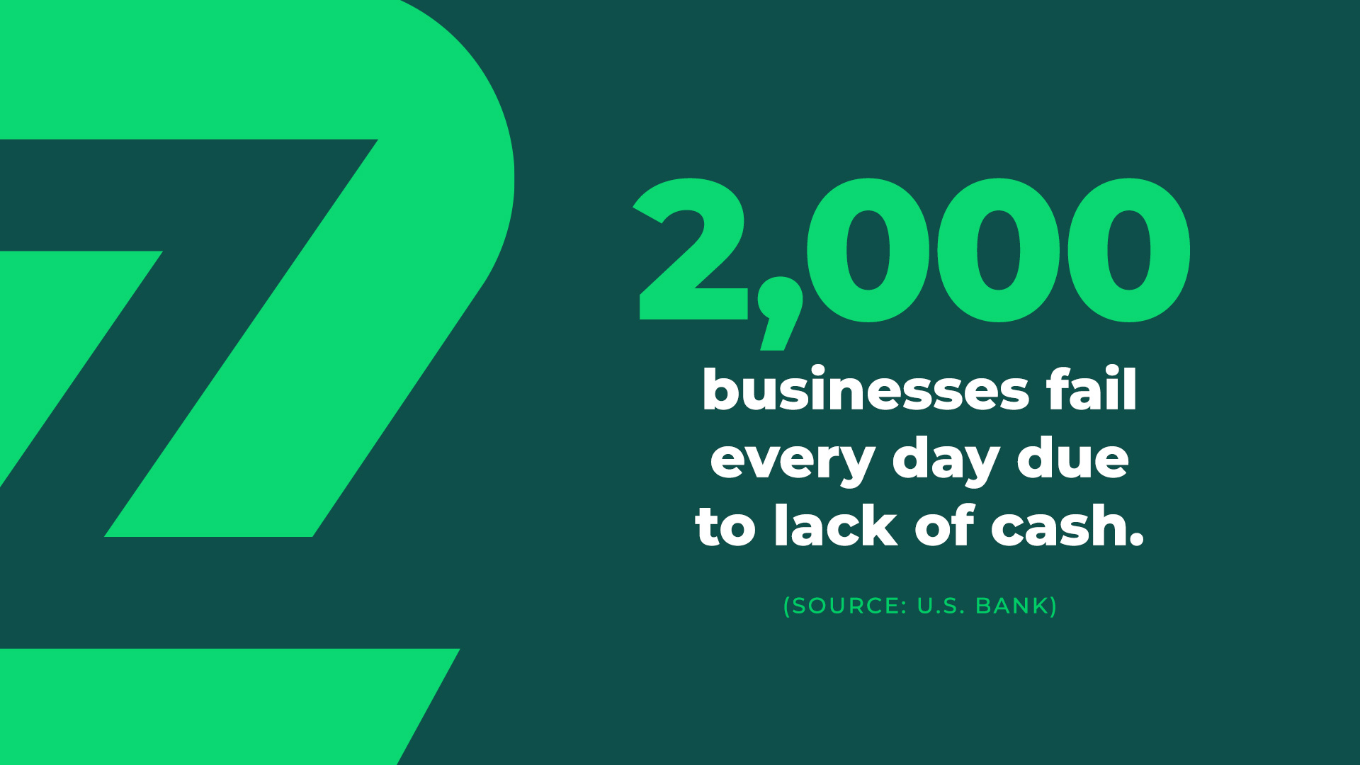
2000 businesses fail every day due to lack of cash.
CORE BELIEF
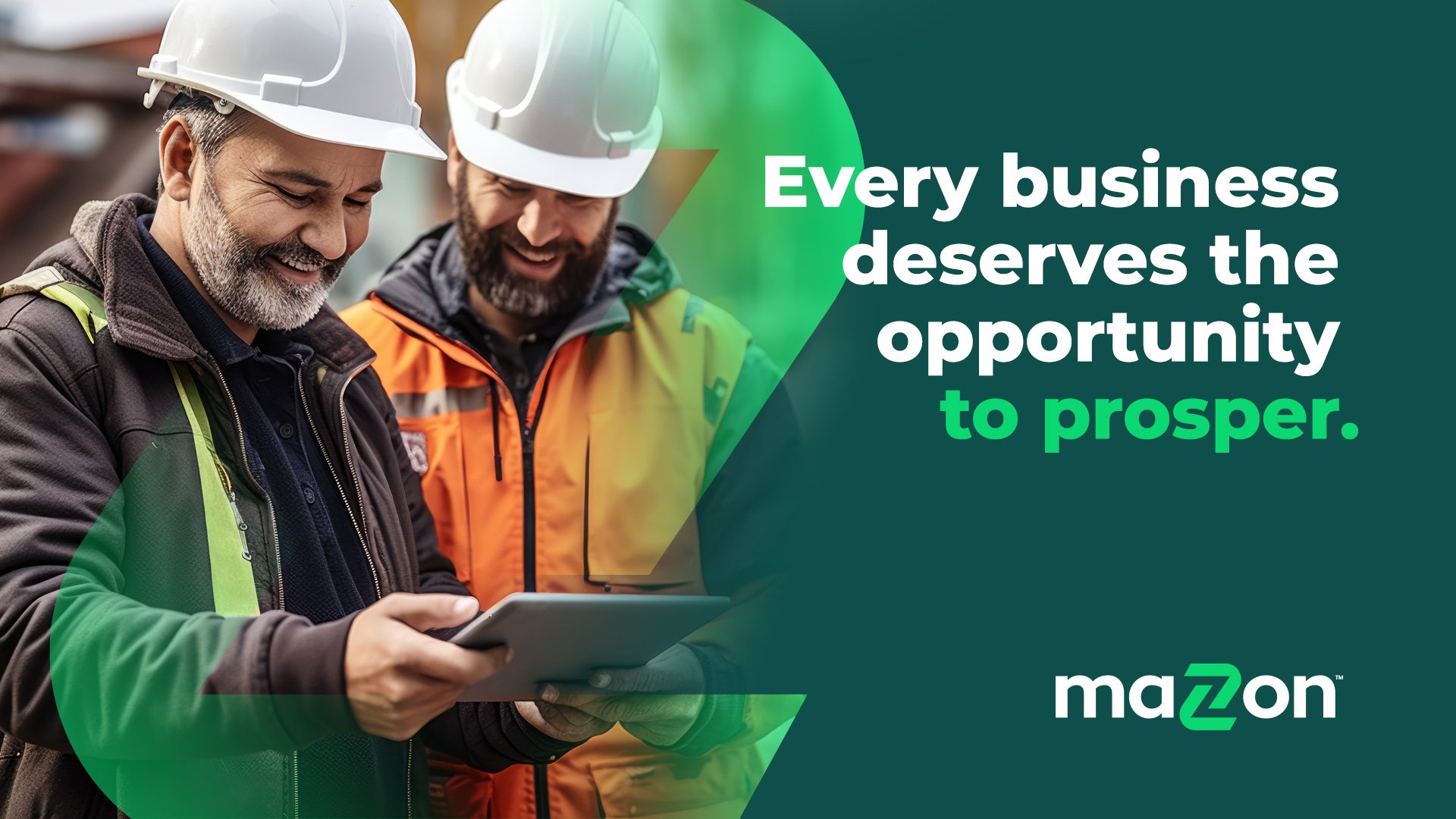
We believe every business deserves the opportunity to prosper.
CORE PURPOSE
We help businesses keep their dream alive, so that more people thrive.
TAGLINE
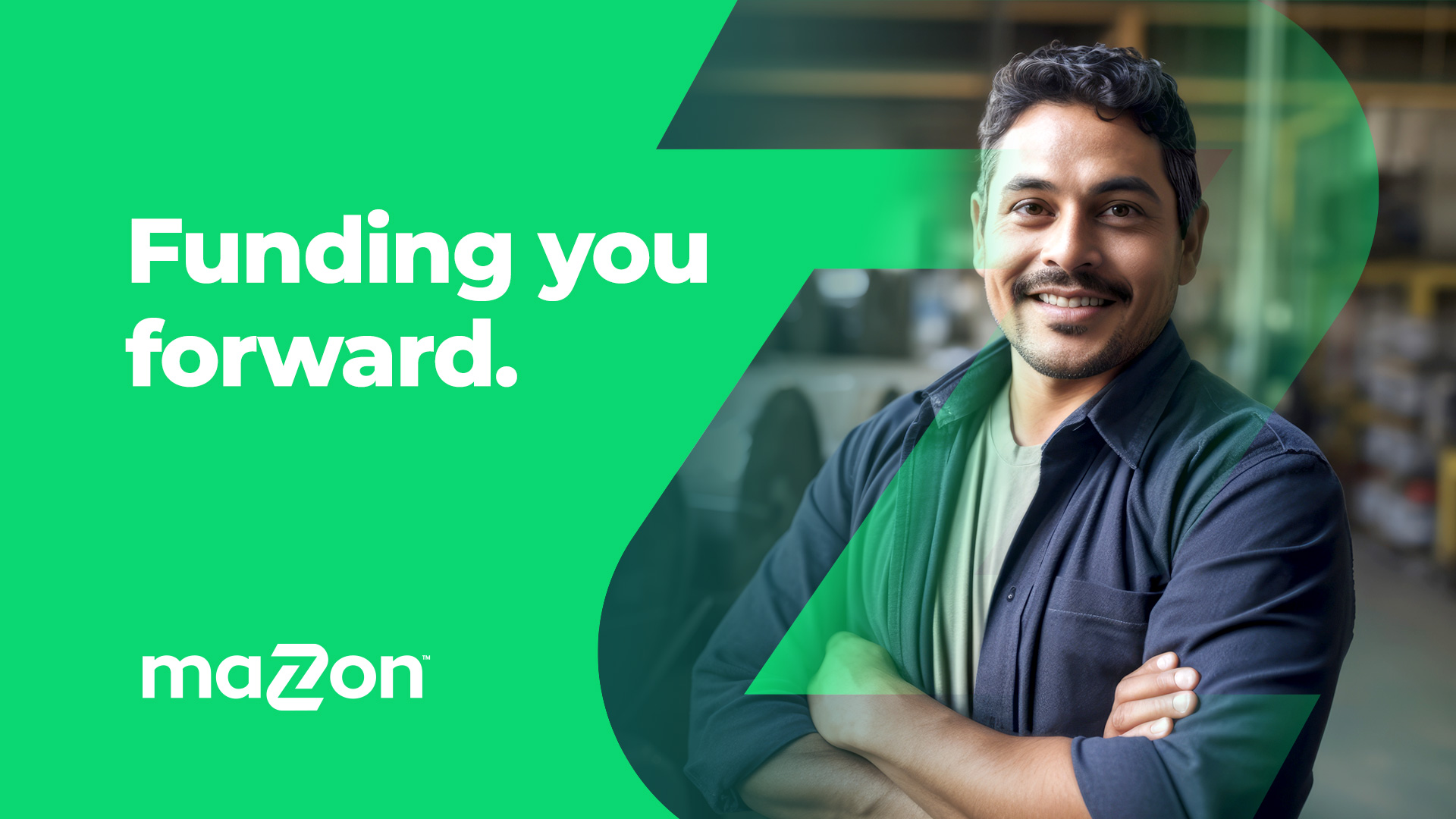
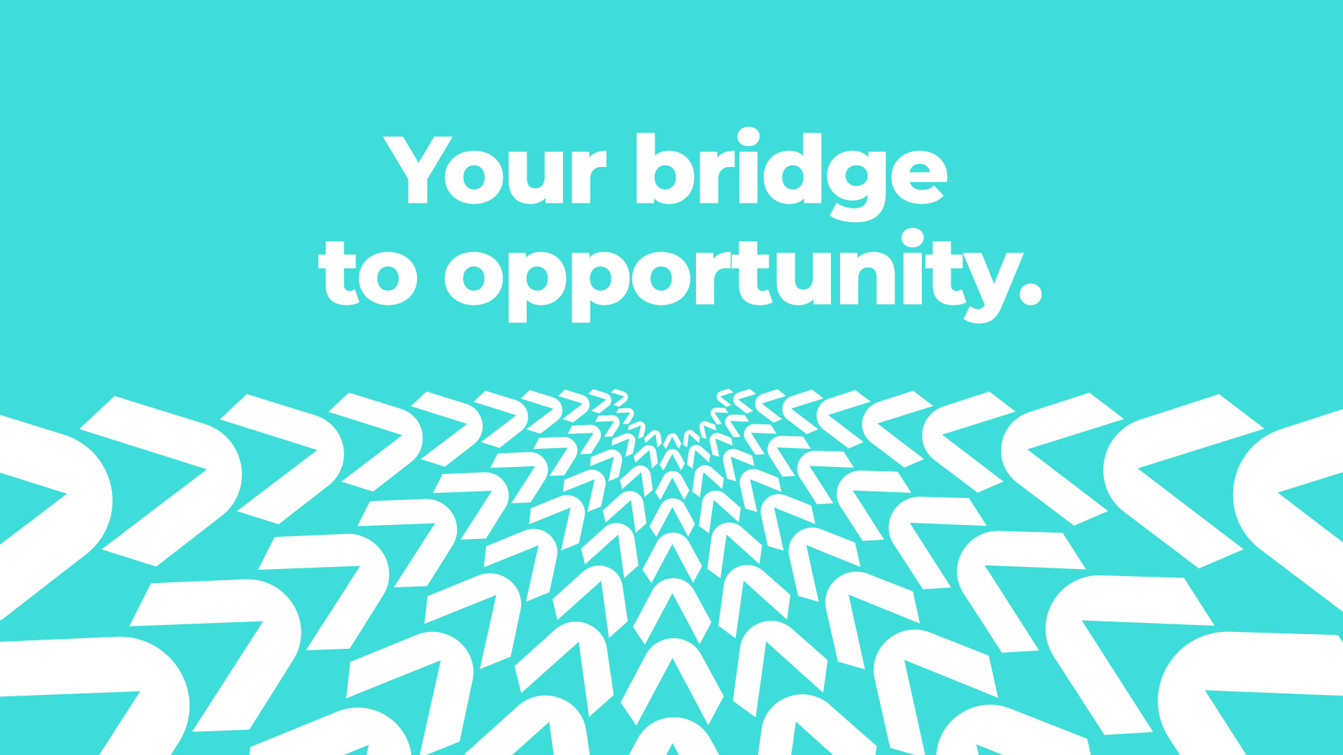
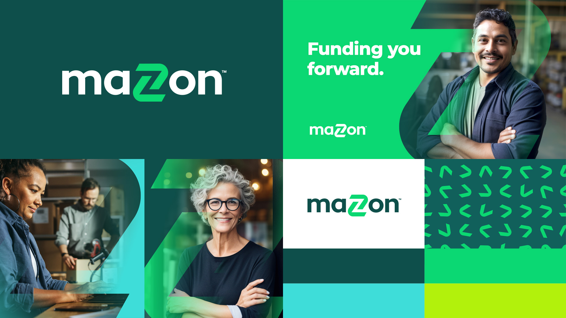
Funding You Forward.
Branding
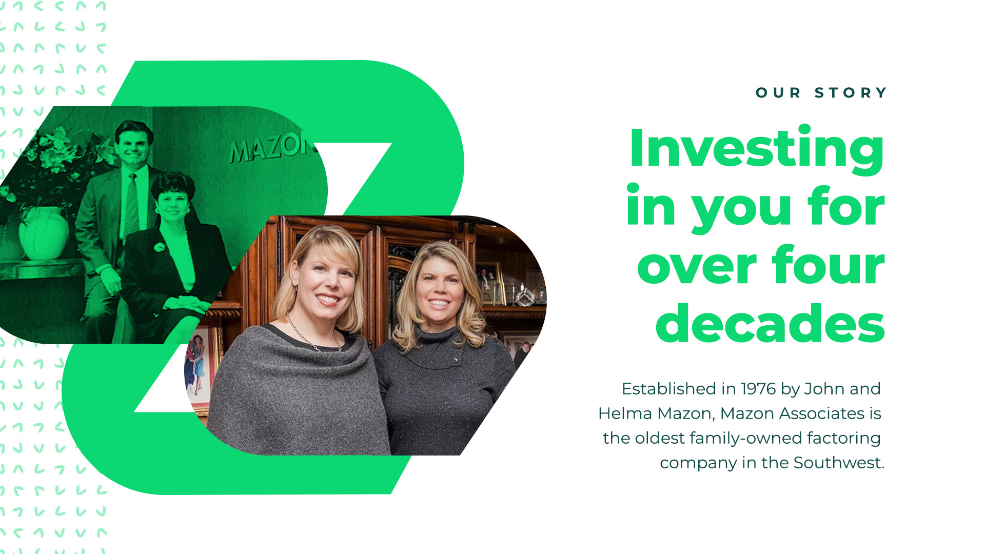
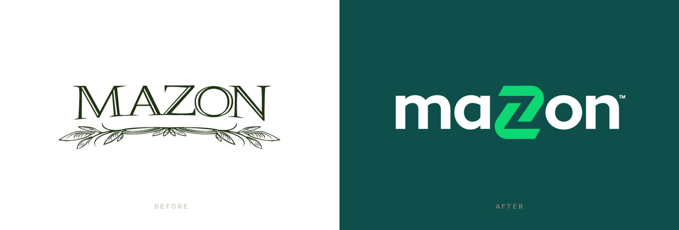
Mazon is a second-generation, family-owned, faith-based company. The Leadership Team had recently transitioned from one generation to the next, and they knew it was time to refresh the brand of this nearly 50-year-old company. They chose to partner with AM to make sure their new brand was purpose-led and engaging and set them apart in their industry. They wanted to appropriately retain the legacy of this great company yet position it for the vibrant future ahead.
Our Ovrflo process was a perfect fit for this client. We dove into their rich history and identified a powerful purpose to build their brand and culture messaging on. We uncovered that nearly 2,000 businesses fail every day due to a lack of cash. That is a lot of livelihoods at risk if they can’t find the funding partner to keep their dream alive. That kind of purpose stirs emotions and increases engagement in the Mazon team to know so much impact is at stake in their work every day.
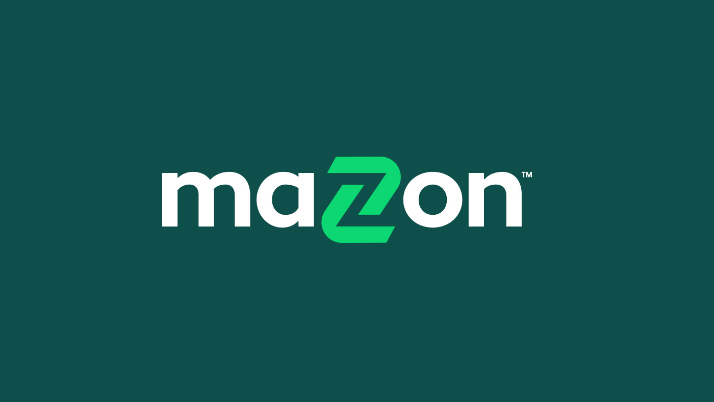
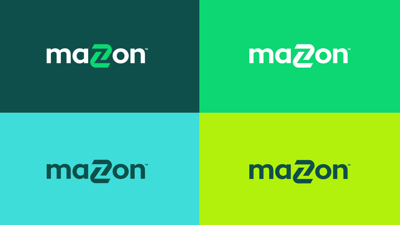
That purpose is the foundation for their new brand elements and messaging. The logo icon is two arrows coming together to form the Z in their name. The arrows visualize the growth and movement in how they fund their clients forward. The color palette is fresh and fun yet ties back to the financial green that tends to represent their industry. The lowercase typography is more casual and bold than their previous logo. This choice makes them feel more relational and approachable to the small businesses they serve.
Website Design & Development
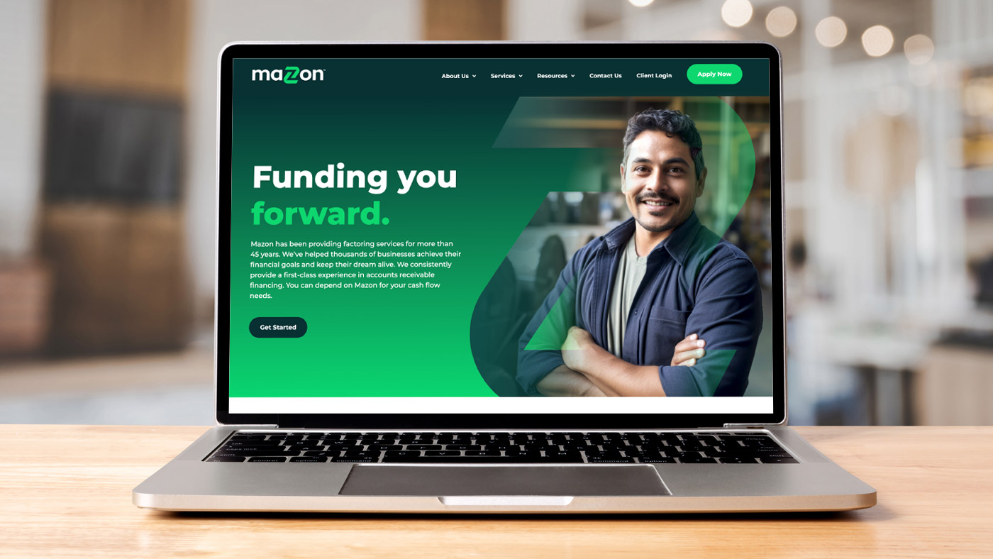
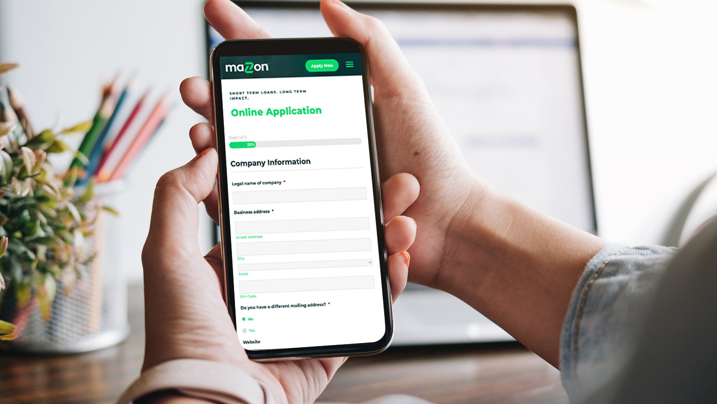
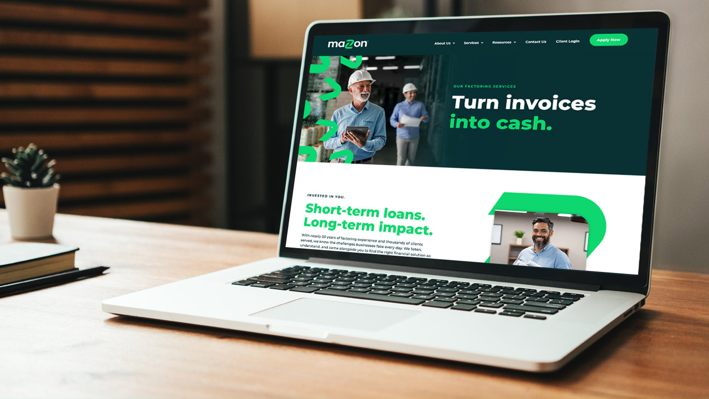
The goal of the new website was to integrate the powerful new brand elements and convey their story to the next generation of small business owners and executives. The site leads with their new messaging and creative direction and uses imagery of small business owners working in the day-to-day running of their companies.
The site was built in WordPress, which means it’s easy to maintain and more future-proof than lesser established platforms. The user experience is great on smartphones, tablets, and computers, making it easy to connect and apply for funding wherever their fast-paced target audience may be.