Highland
Lakes Camp
Highland Lakes Camp


Branding
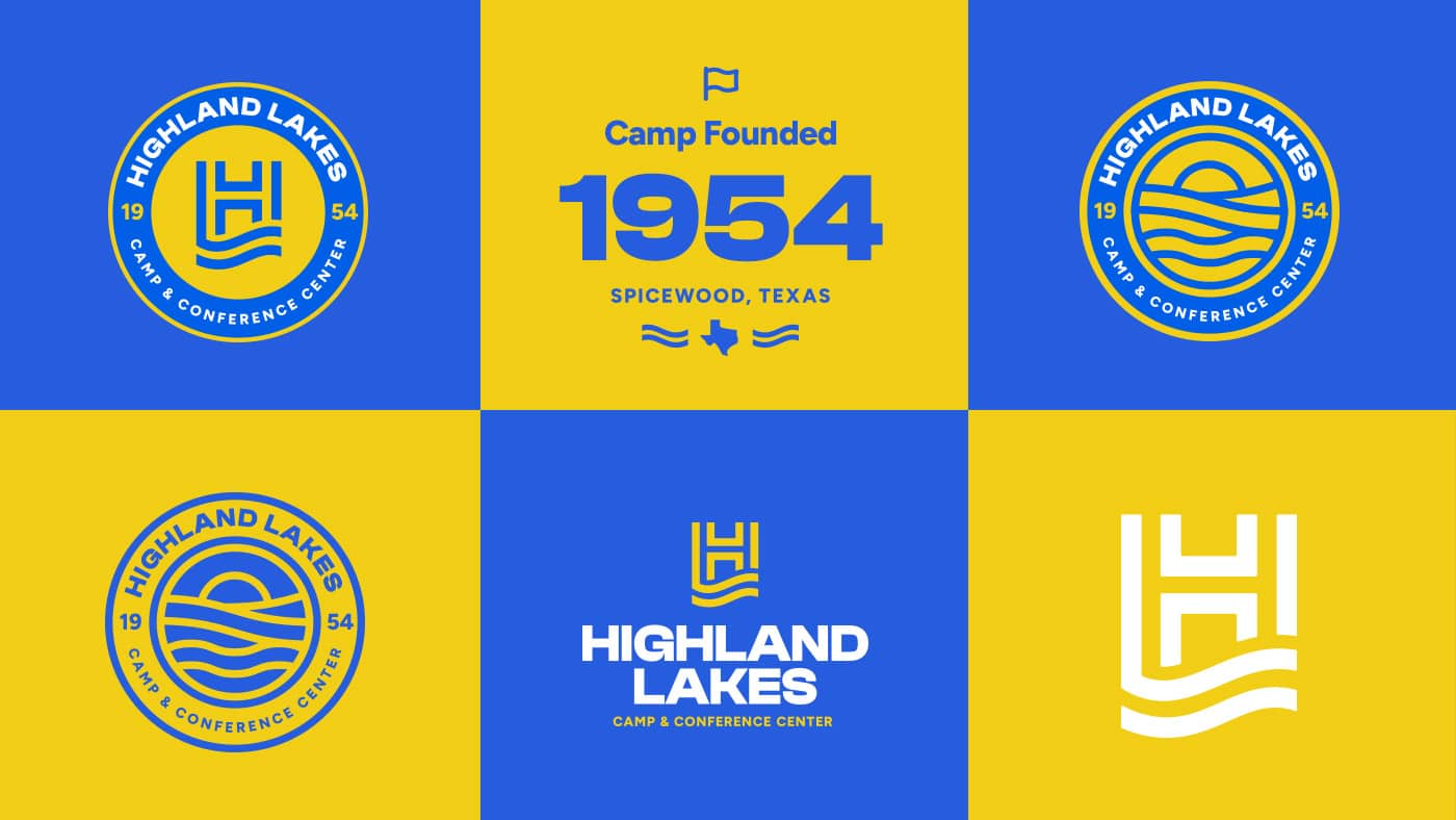
Highland Lakes Camp & Conference Center has been a trusted destination for Christian youth to have life-changing experiences for over 75 years, but it was in drastic need of a rebrand and rebuild to really connect with their young audience in today’s modern world. Our team was able to strike the perfect balance between bold colors and typography that better resonate with younger generations and simplified shapes and vector illustrations that lean on the successful design styles that have lasted for generations – speaking to the decades of trust they have earned with their community.
We started with a timeless-feeling icon that combines the name recognition of “H” and “L” with the flowing lake water shape that symbolizes one of the camp’s biggest draws. From there, we built out a system of logos and badges that offer a range of application options and back it all up with colors, icons, and type styles that help the camp stand out against its more grungy-looking competitors.
The final result is a fully realized brand that kids can get excited about, that their parents can trust, and that will stand the test of time for generations to come.
Website Design & Development
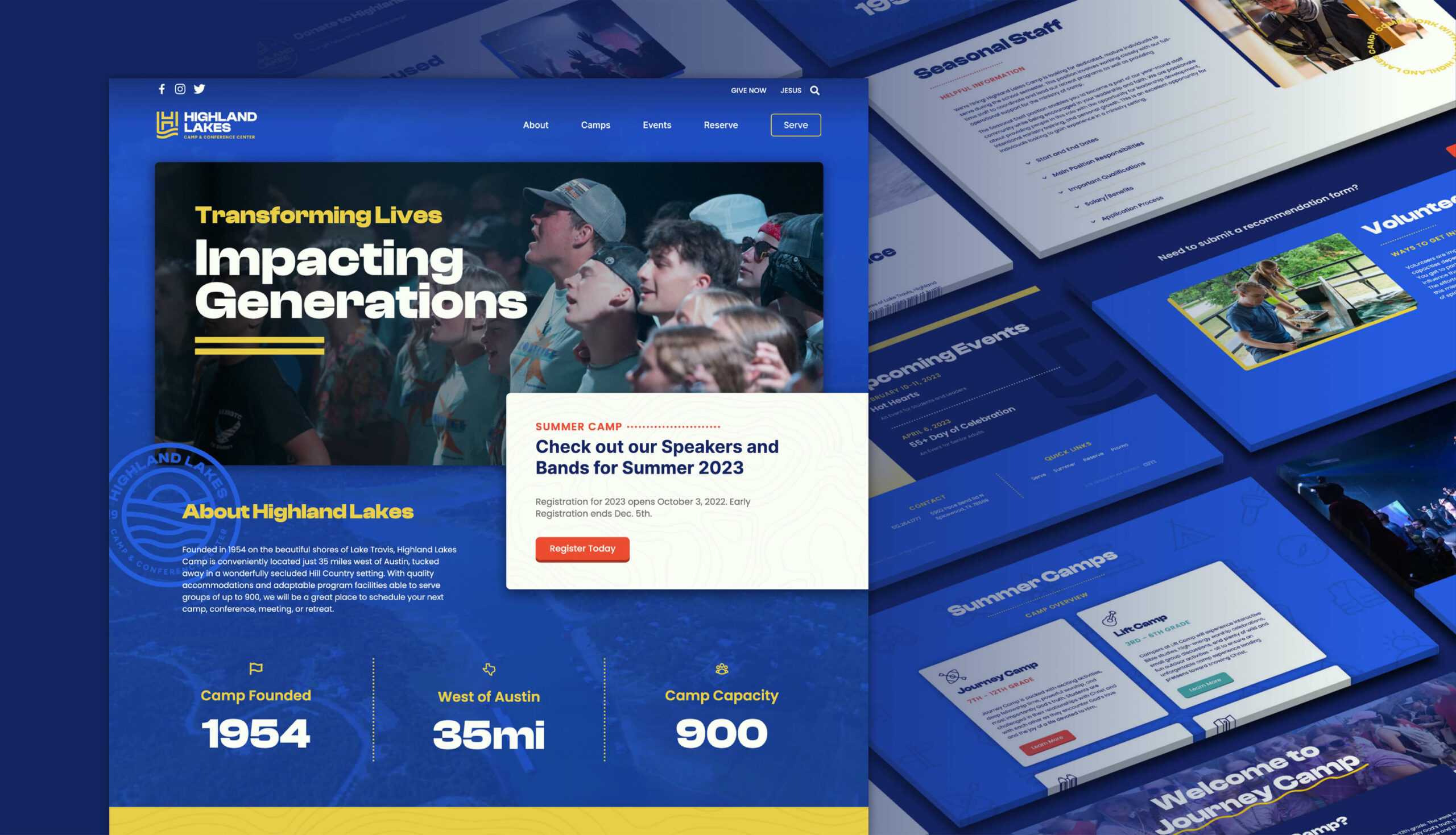
Applying the new brand assets to the website was essential in launching the new brand successfully. This channel is the primary route through which most of their audience discovers them, vets their programs and beliefs, and registers for their events and services – so we had to get this right. The new website was built on WordPress, and content was strategically created and organized to easily and efficiently move their 3 separate audiences toward unique content for each: camp registration, volunteer service, and crucial donations that keep the camp thriving.

